ASIFA-Hollywood Animation Archive: Meta: The $100,000 Animation Drawing Course- Lesson 10
This one took a while. So here it is. Two Donald and Daisy Duck Model sheets. I noticed that Disney character's dates always looks exactly like them except with a dress and eyelashes. Daisy Duck could easily just be Donald in drag. anyway here are the drawings. The red lines are my first attempt. the Blue lines are the corrected version.
Happy New Year!
Sunday, December 30, 2007
Saturday, December 15, 2007
$100,000 Drawing Coures - Lesson 10 - Goofy
ASIFA-Hollywood Animation Archive: Meta: The $100,000 Animation Drawing Course- Lesson 10
Ever notice goofy looks kinda like a homeless guy. I'd give him change.
More too come.
Ever notice goofy looks kinda like a homeless guy. I'd give him change.
More too come.
Daffy Duck Model Sheet
This Daffy Duck Model sheet is my favorite model sheet I have studied. I got the idea from Mitch Leeuwe, a very talented student of classic cartoons.
Saturday, December 1, 2007
$100,000 Drawing Course - Lesson 10 - Viva Willy and Aladdin Model Sheets
ASIFA-Hollywood Animation Archive: Meta: The $100,000 Animation Drawing Course- Lesson 10
These were a lot of fun. Grim Natwick was an incredible artists. More to come.
Monday, November 26, 2007
$100,000 Drawing Course - Lesson 9 Hands
ASIFA-Hollywood Animation Archive: Meta: The $100,000 Animation Drawing Course- Lesson 9
Lesson 9 is drawing hands. This has been the easiest lesson yet for me. I had been using the concept of drawing the palm then the thumb then the fingers for years. The Challenge of this lesson was copying Preston Blair's beautiful line work. Also in doing this I realized that I often make the fingers to long in relation to the size of the palm.
Saturday, November 24, 2007
$100,000 Drawing Course - Lesson 8
ASIFA-Hollywood Animation Archive: Meta: The $100,000 Animation Drawing Course- Lesson 8
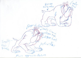
These are my drawings for Lesson 8, proportion and contrast. First are studies of Tex Avery's bulldog. These are more cartoony and have exaggerated proportions.
These are Hanna Barbera's bulldog. He is more evenly proportioned.
Now for the fun part. The top drawing is the more generic version of Hanna Barbera's Bulldog. The bottom drawing is the same bulldog with more exaggerated proportions.The Left drawing is Tex Avery's bulldog with even more exaggerated proportions. The right drawing is Tex Avery's bulldog with more generic proportion
I decided to do a little more experimenting with proportions on my own. Here are three versions of the Yankee's Fan Rat. Each is fatter than the last. I think the fattest one is the best, it could even stand to be fatter.
Finally, how much junk in the trunk is too much? It's up to you.
Subscribe to:
Posts (Atom)